Monday 13 September 2010

300 Speakers, 26 Letters and other Oddities

Currently showing at the Saatchi Gallery, Newspeak: British Art Now celebrates the creative offerings of a new generation of young British artists. The collection seeks to defy the Orwellian brainchild "Newspeak" - a universal language whose vocabulary shrinks with every passing year - by showing that a multitude of visual languages are being exploited in contemporary Britain. Here are some I was drawn to:

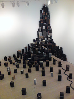
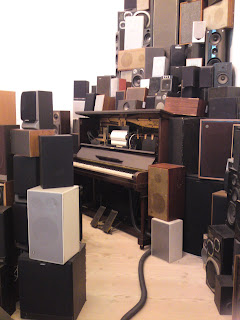
Despite the variety on display, exhibited sound artist John Wynne highlights issues of endangerment, obsolescence and extinction. His untitled installation of 300 speakers, a player piano and a vacuum cleaner plays with these notions, as modern digital technology distributes sound through the old speakers rescued from a recycling plant. The resulting "music" is eerie - a slow-paced, perpetual, nostalgic noise pollution of sorts. In the past, Wynne has produced installations focused specifically on the subject of endangered languages, such as Hearing Voices, based on "click languages" spoken by the indigenous Khoi and San inhabitants of the Kalahari Desert.


Below is detail from She Gets Even Happier, a collage crafted by the scissors and pen of Clunie Reid. By scrawling the words "I Shop in Iceland" over British Spears's face, she is mocking the cult of celebrity and the media overload that propels it. She is like Warhol-in-reverse, taking icons and making them ordinary, bringing the likes of Britney crashing down to earth from the great heights of glossy stardom.


Ged Quinn's Dreams Of Peace And Love Gradually Giving Way is based on Claude's Landscape with the Arrival of Aeneas at Pallanteum from Anglesey Abbey. The artist specialises in paintings that include contemporary images in idyllic scenes copied from classical paintings. In this particular piece, part of Aenea's ship has been recycled into a miniature cinema showing Little Tinker, and another part is carrying the Discovery from Stanley Kubrick's science fiction film 2001: A Space Odyssey.


A Joan Crawford Alphabet is typical of Donald Urquhart's work, which tends to indulge in the dark side of of Hollywood glamour in a somewhat simplistic and light-hearted way. This artwork is miles away from the 26-letter wall chart one would find in a school classroom; does Urquhart smash childhood innocence, or is he merely injecting some playfulness into his depiction of Crawford's life?


Thursday 2 September 2010

Magnificent Maps

Due to some builder-related technical fault, the phones and internet at my work were down, so I was allowed to leave the office at 3pm. This left me with over four hours until I was due to meet friends for a meal in Covent Garden, so how did I choose to fill my time? I walked from Golders Green to the restaurant - a valiant effort, considering it was 6.5 miles in shoes that pinch! (My toes are still a little deformed from the trek.) One of my rest-stops was the British Library because I'd heard about its current exhibition, Magnificent Maps: Power, Propaganda and Art, and I happen to be weirdly interested in cartography (if you didn't think I was cool already...).

When you look at a map, you have to think beyond the science of longitude and latitude. Maps are hugely subjective; they don't just fulfil a geographical purpose. For example, they've often been used for self-aggrandisement by national leaders, who seek to impress upon others their status as ruler over a "great" land. Imperial rulers would demand that their conquests be signified on official maps; kings of relatively small countries tried to compensate for size by insisting national cultural and scientific achievements be emphasised by cartographers. Maps have also been used as pieces of political satire, as propagandist artefacts that tell contemporary audiences a great deal about the geopolitical climate that informed their creation.

Some favourites from the exhibition:

Detail from Stephen Walter's The Island, which satirises the London-centric view held by people in the capital. Commuter towns are shown as independent from the city, which appears to be its own country. Note the intricate detail in the second picture.


Dimitri Moor's Be On Guard! shows a heroic Soviet soldier warding off bourgeois threats to the then infant USSR.


Macdonald Gill's Tea Revives the World (1940) is my personal favourite. The message is that tea, and by extension the Allied war effort, can cure a sick world. The map is unashamedly imperialistic in its proud demonstration of Britain's economic and colonial dominance. I guess Gill didn't anticipate the decline of the British Empire in the post-war period.


Confiance was made in Vichy France to demonise Churchill as a land-grabbing octopus, whose tentacles needed to be severed by the Axis powers. The octopus motif is a pretty common one; it was first used in cartography to show the imperialist threat posed by the Russians in the late nineteenth century.


If you're at all interested, some satirical WWI maps can be found here.